"Horizontal I"
Oil on canvas.
First in a new series, and so called as the diagonal has been lowered. Kept the portrait format. Same varied application, and colours still chosen purely for their compatibility, but simply by having a sense of horizon this modified approach is likely to let people in more easily and will to a degree allow a figurative interpretation. It is a bit of a challenge to balance the adherance to non-figurative concerns in a format which allows figurative interpretation, without actually becoming figurative; I am determined to use the same methodology, and to maintain a colour choice without figurative influence, but I do feel this is a promising start, and gently facilitates an easier appreciation, even if that is only on a basic level.
Central is the beautifully translucent orange of "Indian Yellow" laid thinly over the grey of a broken "Raw Umber". This has tended the orange toward an ochre, hence the neighbouring above with the broad thick application of the opaque "Yellow Ochre", making comment on the possible similarity between two otherwise very different colours. The ochre stands out markedly from the blues and deep reds beneath.
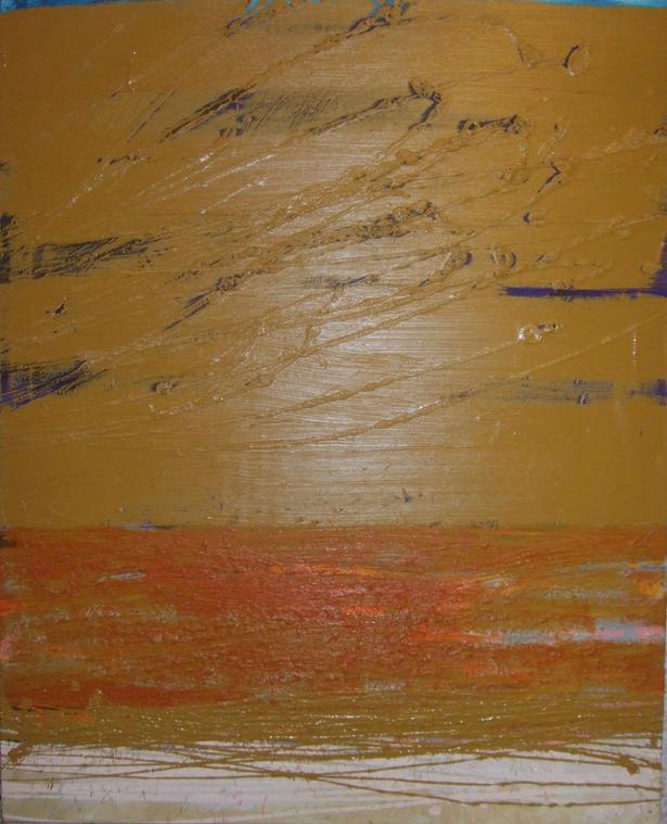
click image for a detail